The Challenge
Covid-19 Saliva Testing Programme was recently launched as part of the mandatory testing measure for border and funded workers. FutureLab Digital was approached for Web Development work. We understood the need—a new, user-friendly website that serves as the one-stop shop for all information related to the services offered by this programme. From registering for the programme to ordering the Saliva Testing Kit, detailed information had to be accessible on the website.
Given the significance of the Covid-19 Testing programme, we had to ensure that the website design is flawless. With the very short deadline, we made sure that the quality and user experience would be delivered to the customer’s expectation.
The Outcome
Our Web Design team built a modern, sharp and functional website with all the suitable design elements needed. The timelines were stringent, and the target audience kept changing based on gathered research data. Therefore, we had to iterate the user journey often given the various choices on the website.
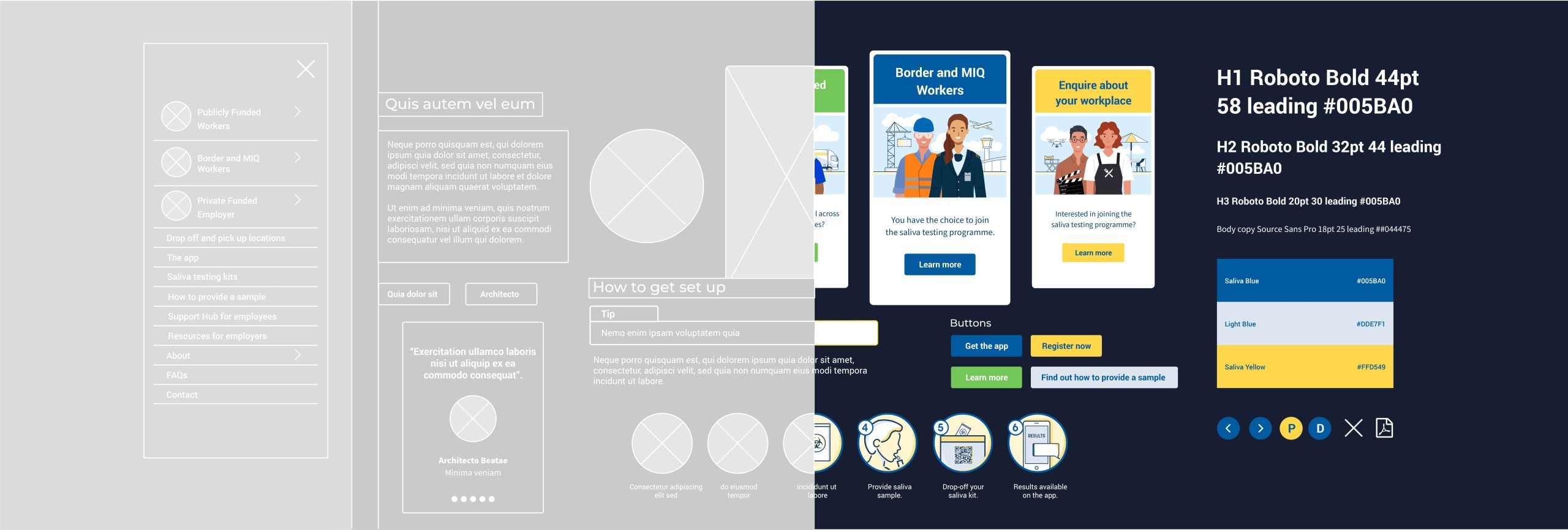
We painted the website canvas with blue and yellow that perfectly compliment each other. One of the main requirements was quick access to information. With our rich experience in website development, we structured all the information into appropriate sections. As a result, we built a high-quality website.
Users can comfortably navigate to different sections of the website and find what they’re looking for in just a few clicks. The font we used was easily readable, and gelled with the images and design elements of the website. We wore our creative hats to design the Saliva Testing logo aligned to the client’s requirements. Ultimately, the website we built is useful; thereby, enabling scores of border workers to hastily access, register and complete the Covid-19 Saliva Testing. More importantly, users can process all information in a hassle-free way.

Well-Designed Illustrations: The Soul of Any Website
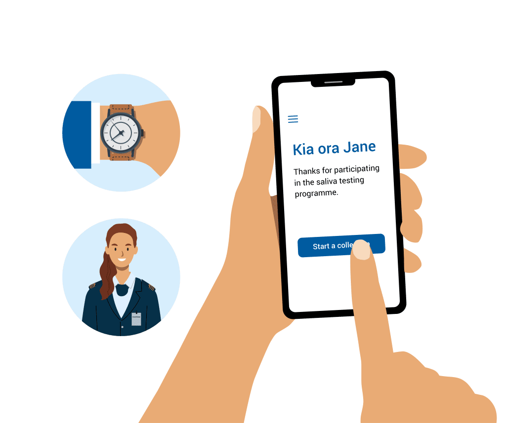
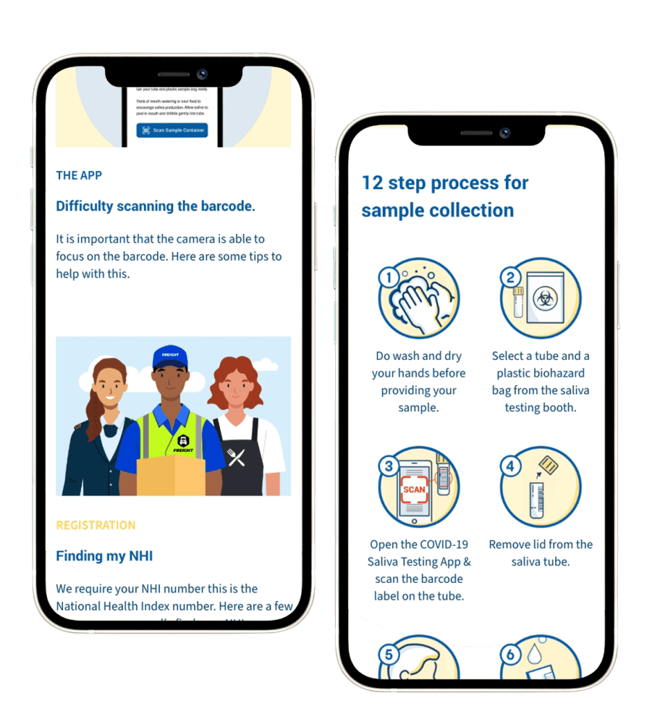
Aesthetic Value is indispensable and the soul of every website. Therefore, we created dozens of illustrations representing border workers. And, the settings that they’re a part of too. Users can connect better with the target audience of the site.
The website had multiple integrations to load data to client’s internal software. Moreover, we extended a few design elements of the logo unit throughout the website. As a result, the web design was consistent and nuanced.

We Complied with UX Design Principles
We designed the website in keeping with UX Design Principles commonly accepted by design experts. From the home page till the very last page, users can browse through information effortlessly. Information about the whole process of collecting a Saliva test kit and dropping it off at the appropriate location is easy to access. Furthermore, users can better understand the steps involved with the appropriate icons & illustrations that we designed.
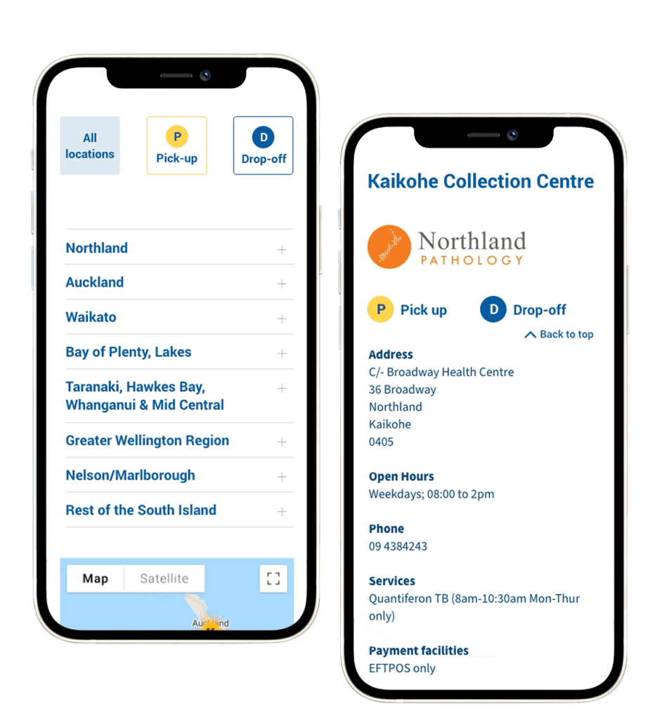
Meticulous Attention Rendered to the Mobile Version
The website is mobile friendly and is equally aesthetic as the desktop version. As many users prefer using mobile phones, we ensured that the website is aptly optimised for mobile devices. We incorporated the right text to image ratio to easily understand the information. Precision, style and functionality were top priorities. And, we endeavoured to build an effective web design.
Marketing Collateral Designed by FutureLab Digital
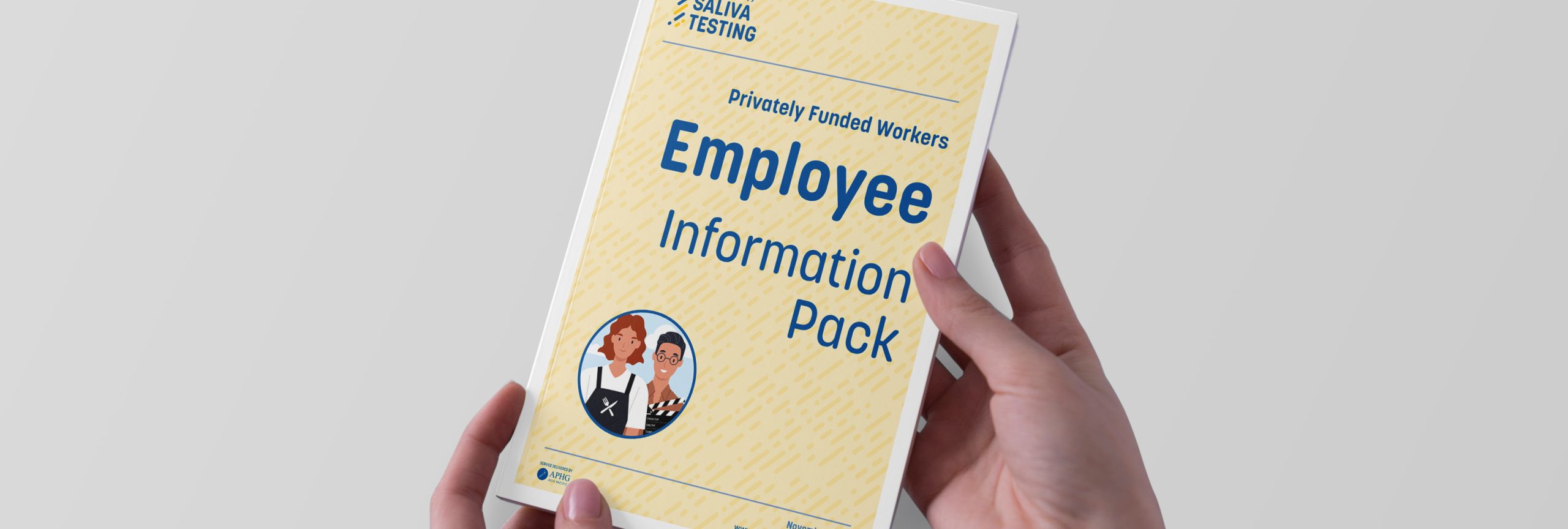
In addition to the website, we designed the marketing collateral including posters, user guides, and creatives for booths. These promotional material were used across the website as well as physical venues to generate awareness of the Covid-19 Saliva Testing Programme. We designed bold icons and illustrations that convey the specific step in the overall process. As a result, with a mere glimpse of the page, users can instantly understand what’s needed.
Simple yet aesthetically strong imagery is necessary for a website design. And, we strived to achieve that perfect balance of the right illustrations, colours and the ideal web design layout.
