The Challenge
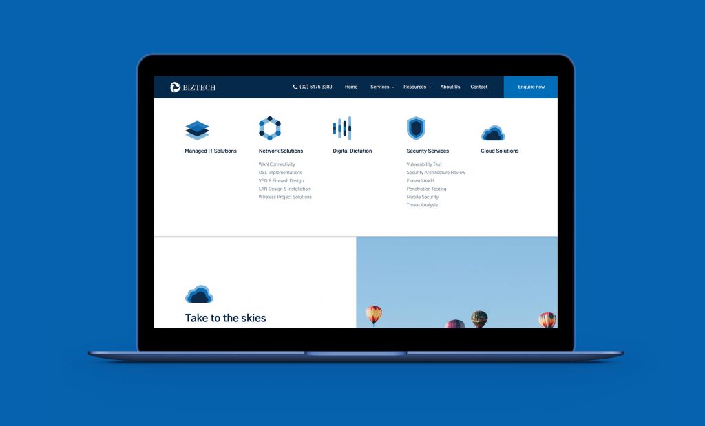
Biztech wanted a simple and effective web navigation to maximise usability and to also improve user journey throughout the website. These are all part of the bigger goal to encourage user conversions.
The Solution
FutureLab Digital created an enquiry form accessible for users from anywhere in the world. It is an intuitive way for users to complete the form quickly by selecting options made up of icons. A new visual and create structure of the enquiry helps to take out the lengthy period used in completion and such leads to improved user conversions.
A UX-friendly, Responsive Website Design
The website is pleasing to the eye and effortless to navigate through. The box-structure used creates a logical-sense that runs throughout the website. This type of structure is a great way to organize content and it improves user journey.
Enhanced user journey sees a benefit for Biztech. The sleek presentation and innovative structure of the contact form switches out the need to type. Now, users can conveniently complete the enquiry form in a breeze.
