Challenge
Ecommerce retailer, Class Furniture, wanted a new website design that would elevate their web presence while retaining their branding elements. All the intricate design nuances had to harmoniously gel and render a hearty welcome to customers.
Improving website performance and purchases were critical objectives for the NZ business. Our client was keen on capturing customer attention by enhancing user experience through an innovative web feature. Nestled within the graphic elements of the website, the new feature would enable customers to view product information effortlessly.
Furthermore, Class Furniture wanted to:
- Upgrade the website navigation to help users find products without any hassle
- Improve product purchase experience by reducing decision-making time
- Enable integration with Accredo, ensuring every sale is submitted to the accounting system
- Simplify content management, making it easy to view product information
- Improve website speed and structure for a better Google ranking
Outcome
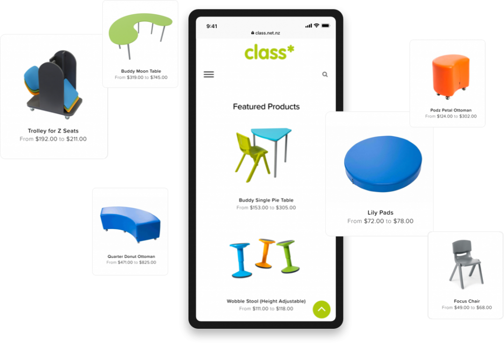
The new website wore a contemporary, vibrant look – a significant makeover from the old website. The professionally-shot furniture pictures hosted on the website exemplify the dimensions of colour and style in a grand way. The fun, energetic and comfortable vibe echoes through all the pages of the website.
By rebuilding the theme to a standard WordPress one with an extension matching Class Furniture Solutions branding. This means that the Class Furniture Solutions theme will have long-term support from the community, and changes would apply to “child theme” modified based on determined needs.
Powerful Branding
The company wanted to increase purchases via the new website. And, we accomplished that by creating a stunning website built to perfection with UX Design principles.
We also simplified the user journey to help customers make a purchase decision quicker through UX. Instead of a customer spending a lot of time thinking whether or not to buy a product, the new web design is attractive and easy to browse that compels users to make faster purchases.

Easy Browsing
Close-up shots of all products, covered in multiple angles donned the image gallery. We created a collage that allows customers to view a wide range of products in one go in a hassle-free way. The exhaustive product list can be easily seen through the web design.

Graphic Design
We designed illustrations of birds, trees and city life that provided a beautiful backdrop for the website. Every design element has a role to play in the storytelling of the website, crafting the ideal school environment for the decision-maker and that helps aid purchases.

Fully Responsive Website
Technical functionalities were carefully implemented to ensure a superior user experience. The new website is also built for a hassle-free experience across a host of devices including smartphones, tablets and computers.
