Challenge
Bravura Solutions is a large IT products and solutions provider based in Australia with offices around the world. With a quick growth, the old website became outdated and lost the touch with local markets. FutureLab was approached to produce a website that will showcase solutions for Bravura’s worldwide customers but also create regional subsites for local markets that will target the local audience with the right solutions.
Outcome
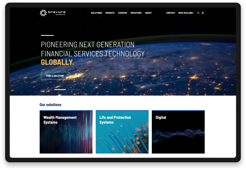
A multi-site website with shared content was a perfect pick for Bravura’s audience. Our focus was to deliver a solution for Bravura customers making it easy to access any information they need. The big imagery approach and colour patterns for products and solutions made it very easy to recognise and present the content on the new website. The use of WordPress also helped multiple office locations to manage their own regional website individually.

Easy navigation through information
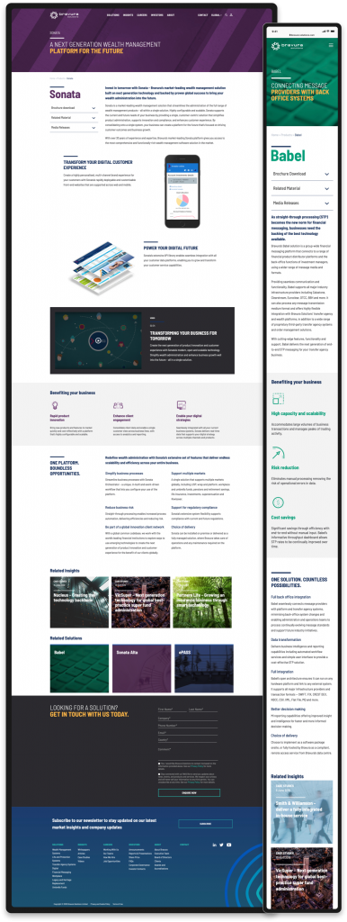
One of the biggest challenges we had was to combine a large number of solutions, products and information on the website and filter them by country. A great example of perfect execution of megamenu and country-specific sub-sites made the Bravura website really easy to navigate both on desktop and mobile devices.
Web Design Case Study – Bravura Solutions

Mobile first approach
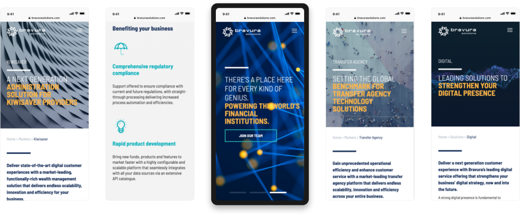
With worldwide mobile traffic of over 50%, we took the Mobile First approach. We built the website to work, look and function on mobile devices best and then we scaled up to make it work on desktop and wider devices.

Designed for international market
Bravura offers a range of IT solutions worldwide. We focused on product and solutions presentation in such a way that the website became the next salesperson for Bravura. The products are unique per country and the website can talk to the local audience in a unique presentation, language and tone. It is also mobile responsive, despite large content, which means that no information is missing on mobile devices.
