Challenge
FutureLab was tasked with upgrading the City Eye design to be more visually appealing and easier to use on mobile, without losing the professional tone and specialist content that City Eye provide to patients about their eye conditions. We highlighted snippets of information along with a clean look and quality imagery, with more detailed content attached to a streamlined list of services and specialities.
Outcome
City Eye Specialists have a sleek new website that reflects their professionalism and attention to detail. The website is targeted to their audience with consideration for those with less sharp eyesight. Plus, it’s easy to find info on services and clear explanations of each eye condition and how to resolve eyesight issues.
Designed with Clients in Mind
One rather nifty new feature of the website is that it caters to customers who might find reading small text a little more difficult. In the top right corner of the screen, simply click to adjust the text size and voila! Instant zoom on the text, making the site easy for all users to browse and find the information they need.

Simple, Beautiful Design
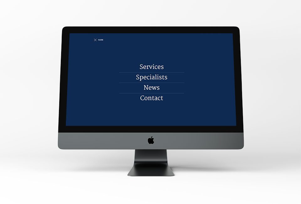
City Eye’s old website had two menus, a crowded page and cramped text. We opened out the page, added high-quality images, made the text content visually appealing and revamped the navigation. You can see the results for yourself in the side-by-side comparison above.
Streamlined Content
City Eye are specialists in eye problems – we needed to convey this while still keeping the website light and easy to read. We condensed and simplified some of their content so that even laypeople like us could understand the explanations of each medical condition. The services menu was also re-jigged to promote ease of finding the right info.

