Challenge
SHARE is a unique organisation – a group of financial advisors across New Zealand who all own an equal share of the company. While that makes SHARE pretty special, it did lead to a certain amount of online chaos – with each owner-advisor establishing their own web presence, and no consistency across the brand.
Outcome
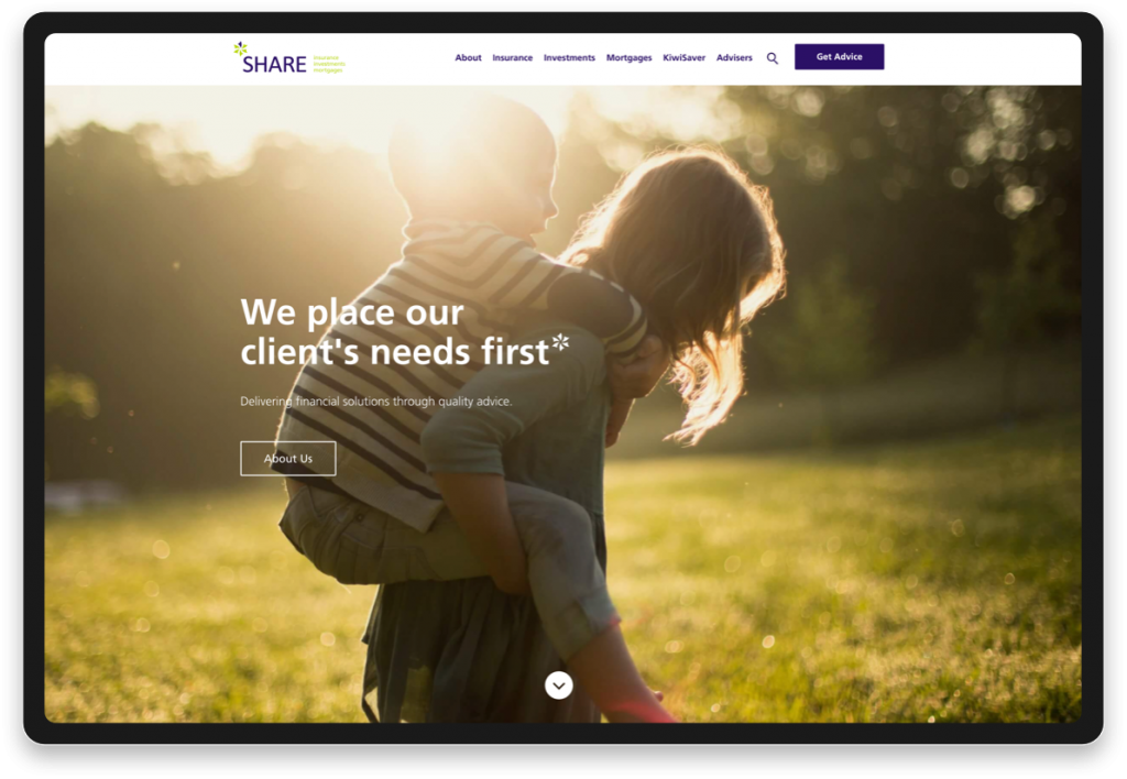
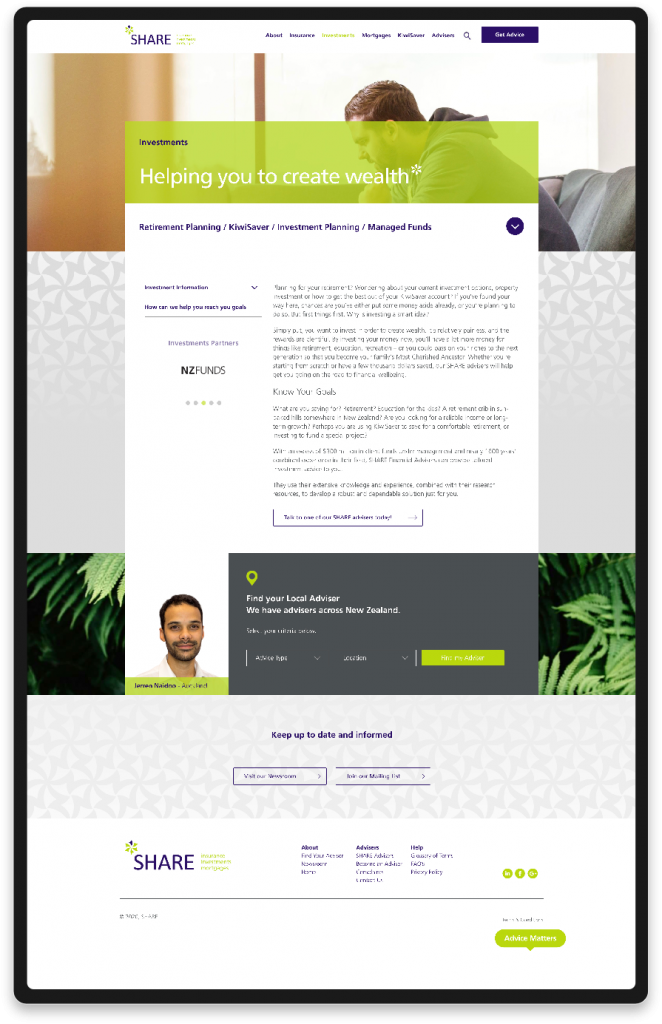
SHARE now has one home online, which accommodates every advisor under one cohesive brand. With the use of a heatmapping tool we were able to understand how users were interacting with the original site. The website is a blend of creative and data-driven design, with clear user journeys.
Stronger SEO on One Multi-Site
One major problem we identified was that the SHARE advisors were essentially competing with each other online – not the aim of the game. So we built one, powerful multisite platform, allowing each advisor to create their own website under the one SHARE umbrella. With one comprehensive website instead of multiple small sites, SHARE could stop competing for online real estate and present a stronger, united image.

Clean and cohesive branding
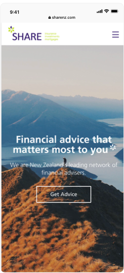
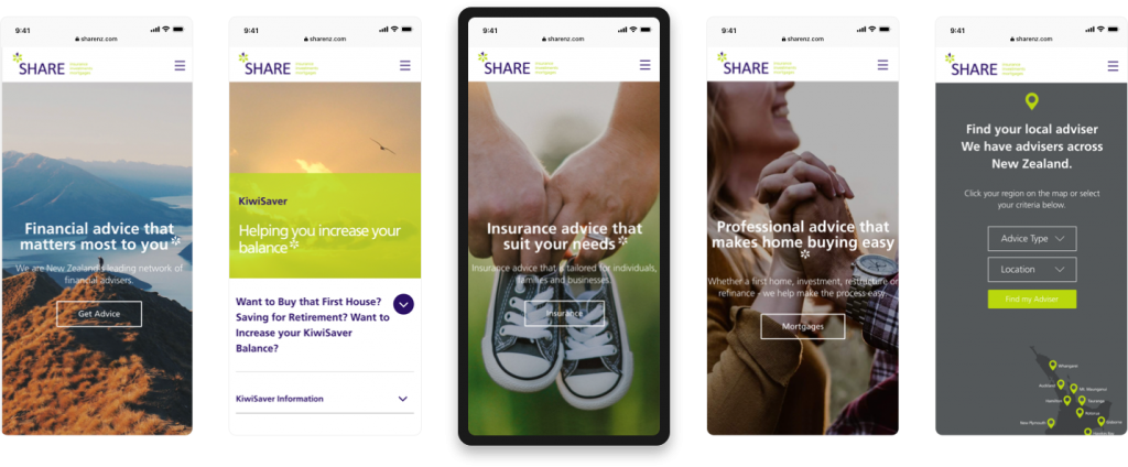
SHARE is all about clear and simple financial advice, and we wanted to create a website which echoed those values. The SHARE design is clean and calming, with four user journeys picked out to efficiently direct customers to Kiwisaver, Mortgage, Investment and Insurance advice. Each advisor’s website adheres to the SHARE branding while giving the advisor room to post content and add their own personal touch.


Clever design with heatmapping
We bring together creative design, development expertise and analytical insight to ensure each project achieves maximum impact. With SHARE, we used a heatmapping tool to understand how users were interacting with the original site. Using that data, we were able to eliminate website aspects no-one was interacting with, while designing with the end-user in mind.

Creating a new website is no easy task, but working with FutureLab made IMG’s far easier. Nothing was ever a problem and no query to big or small we look forward to continuing to work with them in the future as we develop the website further.
Jackie Hancock, Company Administrator, IMG